UNDERSTANDING AESTHETICS
|
| ||
Elements and Principles of Design
There are a number of visual art terms that you are going to have to become familiar with through the course of the year.
In fact the majority (75%) of the assessment tasks are dedicated to your ability to articulate your thoughts about design through visual arts language.
So, become familiar with them! In fact it, if this is something you’re concerned about, you could make this the basis of your Visual Study: How the Elements and Principles of Design are used in a variety of Designs across a variety of fields (Graphic/Product and Environment)
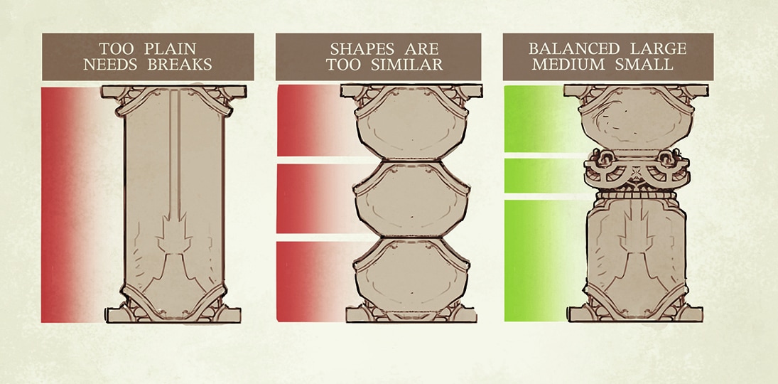
Rule of Three
In this chapter, I want to talk about how developing a better understanding of these terms will help to improve your overall aesthetic.
Aesthetics (how something looks) while being very much a personal decision, is something that you will use to help you attract the target audience of your design.
While symmetry certainly has its place in every field of design it’s the idea of asymmetry in creating visual interest I want to discuss here.
This idea is best communicated through the rule of three.
Most designers will tell you that the rule of three is used because it creates contrast.
It is also used to create effective visual hierarchy and visual variety. A layout where everything is the same size, shape, or color is going to look pretty boring—so contrast spices things up. Visual hierarchy is where you are able to control where your audience looks first (the most important element in your design; the name of your business, the focal point of the composition or a room)
So, Contrast = Visual Variety = Visual Interest. You’ll hear me refer to this all the time.
In design we can look at the Rule of three in a variety of ways, through space, colour, texture, line, and size. How we use these elements and principles is also very important, having even splits (33/33/33 or 50/50) will kill any visual variety you are trying to achieve, so breaking up that split into 60/30/10 or 70/20/10 will help your designs immensely.