Refinement 1:
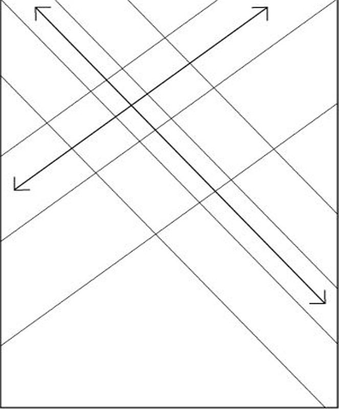
Using one of Müller-Brockmann compositional grids I've tried to align my focal points along the same primary directional lines. The diagonal composition is dynamic and creates sense of movement. Typography however, while adding another, smaller element, is a bit lost and not a primary focal point.
Using one of Müller-Brockmann compositional grids I've tried to align my focal points along the same primary directional lines. The diagonal composition is dynamic and creates sense of movement. Typography however, while adding another, smaller element, is a bit lost and not a primary focal point.
|

|
Refinement 2:
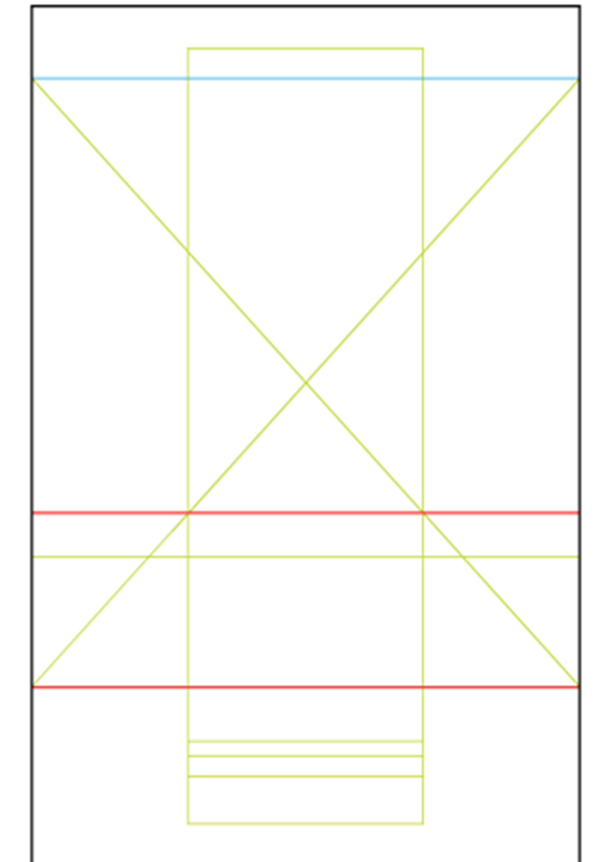
This has a much better feel. Overall the composition has a lot more space to breathe, while still maintaining a dynamic composition. Typography is much more prominent and communicates clearer than Refinement 1.
This has a much better feel. Overall the composition has a lot more space to breathe, while still maintaining a dynamic composition. Typography is much more prominent and communicates clearer than Refinement 1.

|
|
Refinement 3:
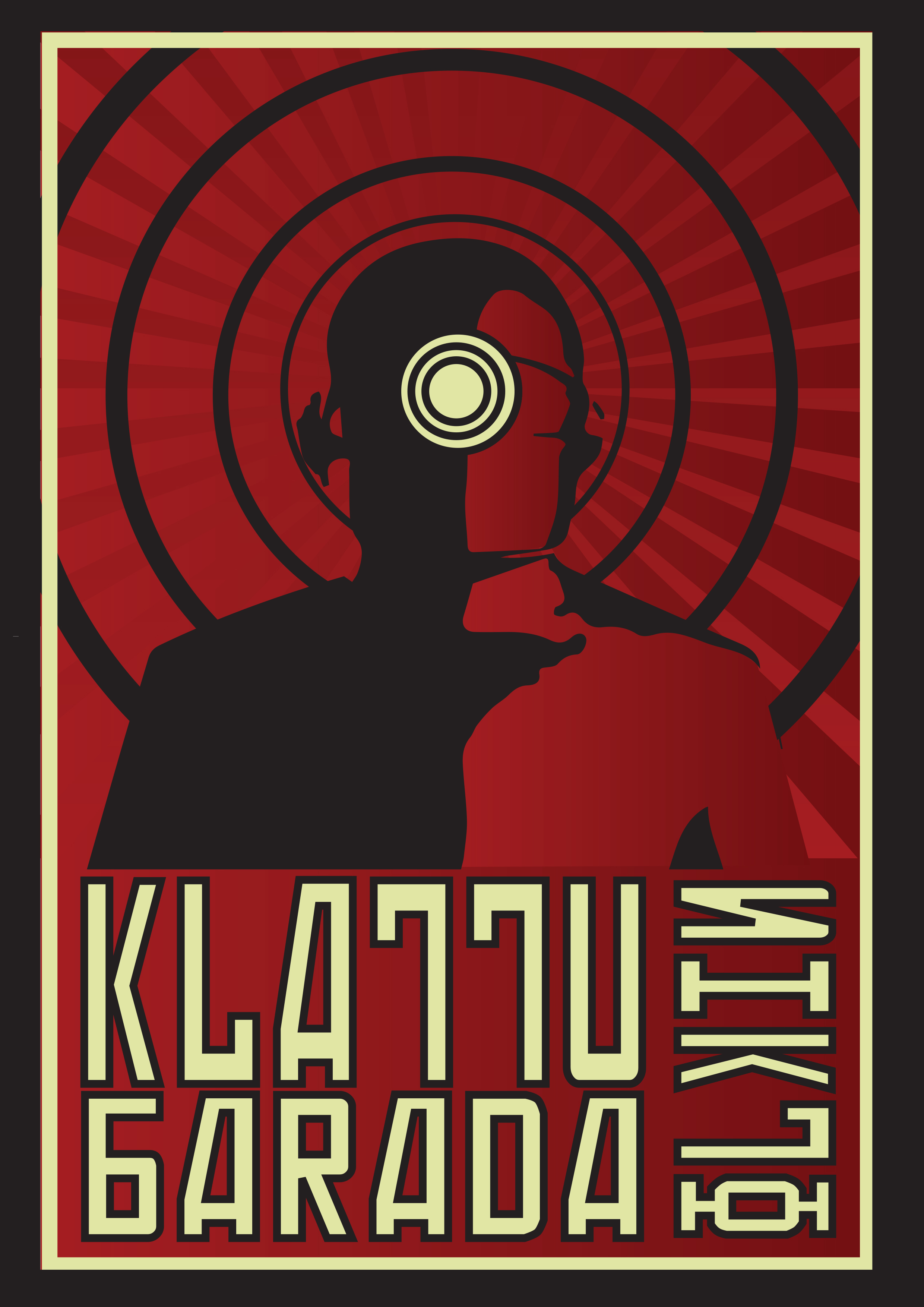
Still using the Muller Brockmann I've gone with a more symmetrical composition here. I was aware that this may lessen it's visual impact, so I've given it a more dynamic look with additional geometric elements including concentric circles and diagonal lines. The variety of sizes and orientation of the typography also adds some more visual variety. Conceptually I'm using one of the central characters from 1951 sci-fi movie 'The Day the Earth Stood Still'. Sci-Fi movies from this era were designed as pieces of propaganda, reflecting the Cold War between the USA and the Russians. The conceptual and aesthetic links are an excellent source of inspiration. The alien in this movie (Gort) takes the role of the Russian. Here he is accompanied by a famous line in the movie, 'Klattu Barada Nikto'
Still using the Muller Brockmann I've gone with a more symmetrical composition here. I was aware that this may lessen it's visual impact, so I've given it a more dynamic look with additional geometric elements including concentric circles and diagonal lines. The variety of sizes and orientation of the typography also adds some more visual variety. Conceptually I'm using one of the central characters from 1951 sci-fi movie 'The Day the Earth Stood Still'. Sci-Fi movies from this era were designed as pieces of propaganda, reflecting the Cold War between the USA and the Russians. The conceptual and aesthetic links are an excellent source of inspiration. The alien in this movie (Gort) takes the role of the Russian. Here he is accompanied by a famous line in the movie, 'Klattu Barada Nikto'
|
|
Refinement 4:
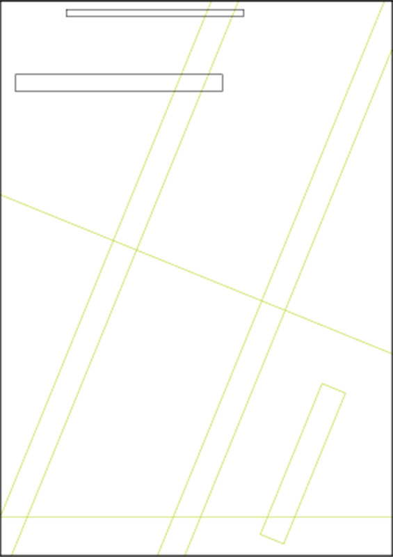
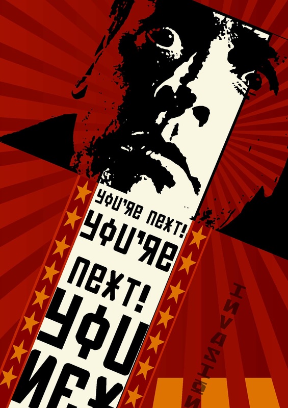
Another Müller-Brockmann composition grid and another 1950's Sci-Fi movie. This time I've drawn inspiration from the 1956 movie, 'The Invasion of the Body Snatchers' There are quite a number of individual visual elements here. This combined with a dynamic composition creates a very busy read, possibly too busy.
Another Müller-Brockmann composition grid and another 1950's Sci-Fi movie. This time I've drawn inspiration from the 1956 movie, 'The Invasion of the Body Snatchers' There are quite a number of individual visual elements here. This combined with a dynamic composition creates a very busy read, possibly too busy.
