In Colour we can use the rule of 3 to create a mood a focal point (emphasis) and harmony if used in a carefully balanced way.
33/33/33 is too balanced and detracts from the visual variety you are trying to achieve.
Try 60 (main colour) 30 (secondary) and 10 (accent).
There are a variety of colour schemes that use a three colour palette; Primary, Secondary, Analogous and Split Complimentary, but remember... balance is crucial.
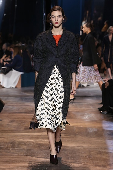
Christian Dior (2016) Haute Couture Spring-Summer 2016 Silhouette 15
Embroidered dark navy wool “Bar” coat and red silk top with embroidered off white silk skirt.
|
Arnell Group (2009) Pepsi Logo (re-design)
The beauty of the Pepsi logo is hidden in the use of two distinct and contrasting colours, split by a irregularly shaped white band. All balanced with precision to create visual interest.
|
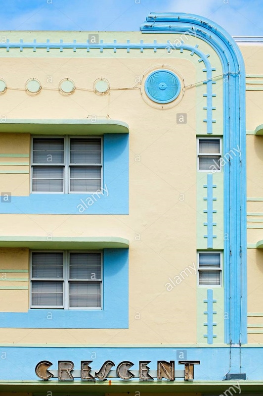
Henry Hohauser (1941) The Crescent Hotel
The soft tan covers 70% of the building, this contrasts with the bright blue (20%) which in turn is softened by the pastel green (10%) achieving perfect balance.
|
