Space can be used to both separate and connect elements in a design.
Wider spaces separate elements from each other and narrower spaces connect elements to reveal relationships between them.
Overlapping elements maximizes their relationship. Tight spaces suggests action and open spaces create visual peace.
Your compositions (how you arrange elements on your page) is determined by how you use the space on the canvas. The composition you are probably most familiar with and is best described through the compositional rule, ‘The Rule of Thirds’. The “sweet spots” – intersecting points along the grid – are where you may want to put your focal points.
Positive Space A physical element, an object, a focal point.
Negative Space Can be used in a variety of ways, it can create areas for your eye to rest and also creates contrast and can emphasise where you want your audience to look. However you use it remember "White space is to be regarded as an active element, not a passive background.”— Jan Tschichold
This use of space (both positive and negative) creates visual harmony and equal weighting in an image without it being a 50/50 split.
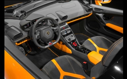
Any space, no matter what size or shape, can be divided into distinct shapes. With this interior (as with any car interior) we can see the rule of three in action. Seats, console and colour scheme all appear symmetrical and are off-set by the wheel, creating an asymmetrical space.
|
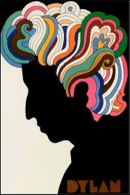
Milton Glaser (1967) Poster for Bob Dylan's Greatest Hits
This promotional poster uses the rule of thirds, emphasising the hair and both positive and negative space to create contrast.
|
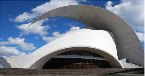
Santiago Calatrava Valls (2003) Auditorio de Tenerife
Similar to the rule of thirds in graphic design, this concept can also be used in a 3Dimensional space. Creating an asymmetrical building gives us both interesting negative and positive spaces which generates visual variety and a sense of energy and movement.
|
