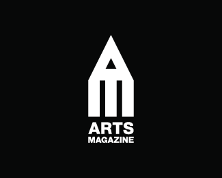
ANALYSIS 1First Impressions:
Logo is for ‘Arts Magazine’. Describe: The style of this logo features both a symbol and name. Logo uses visual triple entendres, with the pictorial element of this logo using positive space to form the lines and point of a pencil, this is combined with typographic elements that reflects the brand's initials (A/M). Overall silhouette also suggests a grand building (a gallery?) Analyse: Logo is evenly balanced with the point of the pencil placed precisely between the two lines of the pencil. Contrast is created through a back and white palette. To create some visual variety and interest, there are an uneven series of white bands (3). Interpret: Pencil suggests arts. Gallery reference suggests tradition and trust. These elements suggest a non-gender specific target audience of a higher socio-economic status. Evaluate: Successfully communicates the main function of the company. Also suggests trust. |
|
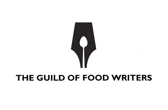
ANALYSIS 2First Impressions:
Logo is for ‘The Guild of Food Writers’. Describe: The style of this logo features both a symbol and name. Logo uses visual double entendres, with the pictorial element of this logo uses negative space to form a long handled spoon. The positive space forms an old-fashioned fountain pen nib. Analyse: Logo is evenly balanced with the centrally place spoon. Contrast is created through a back and white palette. To create some visual variety and interest, the balance between black and white is approximately 70%/30%. Interpret: Long handled spoon, suggests desserts, a friendly comfortable shape as opposed to say a fork. Pen nib suggests tradition and trust. These elements suggest a non-gender specific target audience of a higher socio-economic status. Evaluate: Successfully communicates the two main functions of the company. Also suggests trust and comfort. |
|
